

Dashboard
The dashboard is your daily overview: is the system running, when does it run next, what did it do, how is the account tracking. It is read-only.
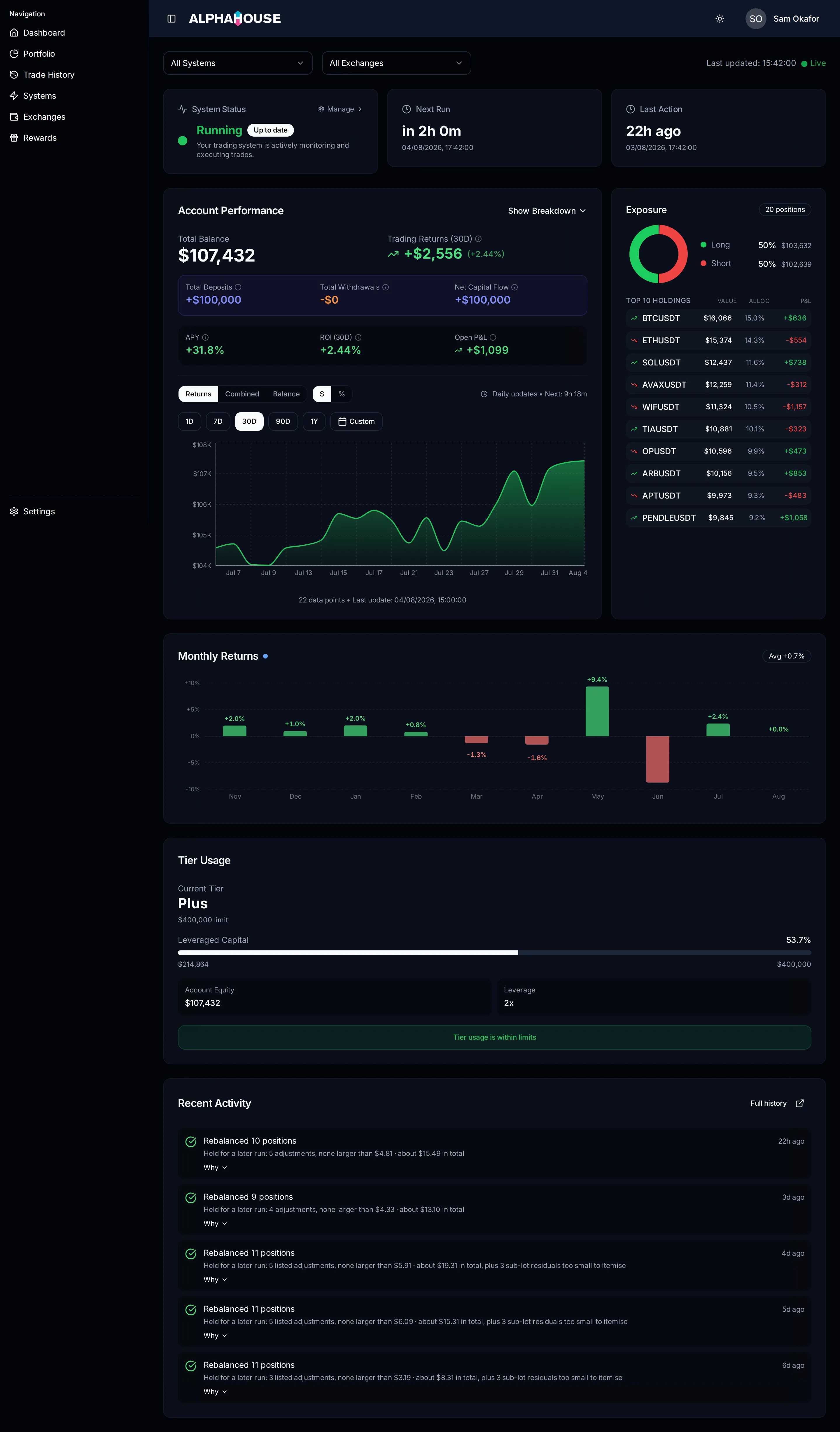
The dashboard with a system running. Figures throughout the docs come from a synthetic demo account, not a real one.
Alerts at the top
Section titled “Alerts at the top”Alerts appear above everything else and each one names the action it wants.
- All trading systems are currently inactive. Every system is stopped, so no trades will run. Activate Systems takes you to Systems.
- Action Required: you have a trading system selected but no exchange connected. Connect Exchange takes you to the Exchanges page.
- Get Started: select and activate a trading system. Shown when you have no systems yet.
If none is showing, your setup is complete.
Filters
Section titled “Filters”A system filter and an exchange filter narrow the historical portfolio figures to what you pick. Leaving both empty includes everything. The selection is shared with the Portfolio page.
To the right, a Last updated timestamp. A green ● Live marker means the
figures came from a direct read of your exchange rather than stored snapshots.
System Status
Section titled “System Status”A single traffic-light. Running means at least one system is active and the daily run will pick it up. Paused means nothing is active, so trading is stopped. Error means something went wrong and is worth investigating.
A second badge shows the most recent rebalance: Pending, Rebalancing, Up to date, Failed, or Paused. The card links to Systems.
Next Run and Last Action
Section titled “Next Run and Last Action”Next Run counts down to the next scheduled daily run, with the exact local date and time underneath.
With no countdown, the card says why: System is paused, Awaiting first run, or Not scheduled.
Last Action shows how long ago the last run happened, with the exact
timestamp beneath. Before your first run it reads No activity yet.
Account Performance
Section titled “Account Performance”The largest card on the page: balance, returns and the equity curve.
- Total Balance is the current value of the account.
- Trading Returns (period) is profit or loss from trading over the selected window, excluding deposits and withdrawals. Dollars and percentage are both window figures, not lifetime ones.
- Total Deposits / Total Withdrawals / Net Capital Flow appear only if money has moved in or out. This is capital movement, not performance.
- APY annualizes the return over the window. It is suppressed for short windows, because annualizing a few days describes the sample rather than the account.
- ROI (period) is the trading return over the window, as a percentage of your balance at the start of it.
- Open P&L is unrealized profit or loss on positions you hold right now.
Show Breakdown splits the balance by trading system and by exchange.
The chart has three modes: Returns plots trading returns only and is the default; Combined stacks net deposits and trading returns, so you can see how much of the balance is money you put in; Balance plots total account value.
A $ / % toggle switches between dollars and change since the start of the
window. Percent is unavailable in Combined mode, because a stacked pair has no
single base to measure against.
Period buttons run 1D, 7D, 30D, 90D, 1Y, plus a custom date range.
Exposure
Section titled “Exposure”Your book split between long and short, as a donut plus a list. The heading reads Top 10 Holdings when there are more positions than shown, and Holdings when they all fit. Each row gives the position value, its share of the book, and its unrealized P&L.
A market-neutral strategy holds long and short at roughly the same size, so a near even split is expected.
Monthly Returns
Section titled “Monthly Returns”A bar per calendar month, up to twelve. Clicking a bar sets the Account Performance chart to that month’s date range.
Tier Usage
Section titled “Tier Usage”How much of your plan’s leveraged-capital allowance you are using: current tier, a progress bar, your equity, and your leverage setting.
- Over Limit means your leveraged capital is above your plan’s ceiling. Your leverage setting is not changed; if it stays over, we move you to the plan that covers it, with notice. Once a change is scheduled the card names the plan and the date.
- Near Limit appears above 80% usage and is a warning, not an intervention.
- Below 80% the card confirms usage is within limits.
See plan limits for how leveraged capital is calculated.
Recent Activity
Section titled “Recent Activity”The last few runs, newest first, each with an icon, a one-line headline, and how long ago it ran.
The icon is derived from what the run actually did, not a raw status field. A green tick means the run did what it was meant to, amber means something needs a closer look, red means it failed.
Rows may also show Held for a later run: …, a summary of adjustments deliberately not sent (routine, see orders that were held), or N need a closer look for outcomes that are not routine.
Why expands the row with the explanation, and See each adjustment opens Trade history.